

01 / Logos & icons
A mark of connection.
Two signal paths, intertwined. Our logo expresses intelligent connectivity and a clear, cohesive view. Always start with the supplied artwork.



Choose contrast. Use the dark logo on light surfaces, or white on dark grey and brand-purple surfaces. Over images, place the logo where the whole mark remains legible.
Place with purpose. Prefer the top-left, bottom-left, or bottom-right. Align with the layout and give the logo room away from edges.


The shadowed icon is a standalone mark. Use the flat icon when it appears with the wordmark. The logos and icons pack includes both.
02 / Color
Clarity, with a signal.
Start with black and white. Bring purple into prominent moments. Use gold sparingly, so every accent earns its attention.
View all 26 colors
On light backgrounds, pair Grey 950 headlines with Grey 700 body text. On dark or purple backgrounds, use white headlines and Grey 300 secondary text.
Download palette ↓03 / Typography
Simple. Structured.
Human.
Modern Era brings a geometric, friendly voice. Modern Era Mono gives labels and interactions a technical character. Create hierarchy through scale, with room to breathe.
Intelligent
connectivity.
Every site. One view.
Keep the message clear and the rhythm even. Use generous whitespace, orderly layouts, and a restrained number of weights.
Labels / Tags / Buttons
Use Regular and Medium weights across both families. Font files are not included in the asset pack; use your own licensed copies.
04 / Brand elements
Order. Energy.
Connection.
Expanding grids, signal paths, and the heat-map gradient bring the identity to life. Use these elements to support a message and give it structure.
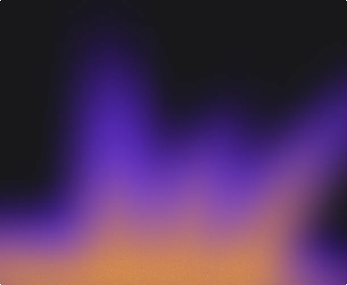
The heat-map gradient
Start the gradient at an edge and let it stretch across the canvas. Keep the blend predominantly purple, with gold near the origin.
Download PNG ↓
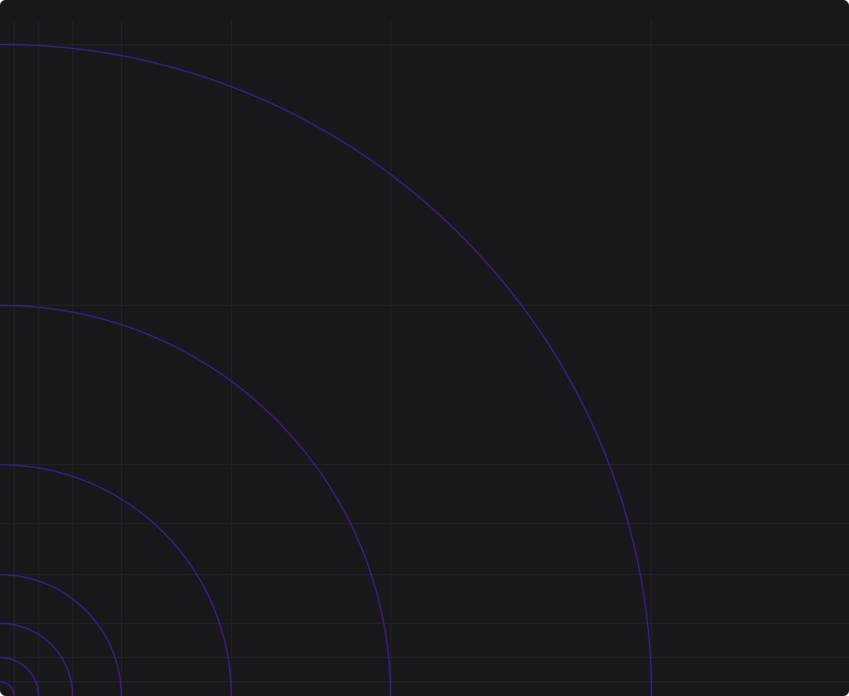
Grids & signal paths
Let spacing expand as a signal travels outward. Align content with the grid, and use dividers when adjacent column structures change.
Download SVG ↓
Grid spacing is roughly inspired by the golden ratio, with optical adjustments allowed. The graphics pack also includes center-line, asymmetric, and two-, three-, and four-column grids.
Get all graphics ↓05 / Brand in practice
Keep it unmistakably eino.
Use the supplied assets consistently. The full brand book includes visual examples, detailed color pairings, and layout guidance.
Use
- Original logo files with clear contrast against the background.
- The flat icon in the logotype; the shadowed icon on its own.
- Black and white foundations, purple highlights, and restrained gold accents.
- Modern Era for reading and Modern Era Mono for UI details.
- Grid-aligned content, expanding line spacing, and clear dividers.
Avoid
- Combining a shadowed icon with the flat wordmark.
- Placing the logo too close to edges or over a busy image.
- Letting gold dominate the visible gradient.
- Cluttered layouts or unnecessary font weights.
- Placing the gradient origin in the middle of the canvas.
06 / Leadership
Executive bio.
The approved executive headshot and bio for press, event programs and partner materials. Please use them as written.

Payman Samadi
CEO & Co-founder
Payman Samadi is the CEO and co-founder of eino.ai, where he's building an AI-native platform for designing, monitoring, and managing any wireless network. He holds a PhD in Photonics and brings a research background from Cornell and Columbia, with more than 30 co-authored papers in peer-reviewed journals and conferences spanning network architecture, software-defined networking, and big data analytics. At eino, he's focused on the networks Physical AI runs on, making the way they're designed and operated unified, agentic, and multiplayer.
07 / Downloads
Ready when you are.
Get the complete kit, or choose just what you need. Each pack contains clearly named files for the formats and backgrounds shown above.
Complete brand kit
Logos, icons, avatars, all 26 colors, graphics, typography guidance, and the brand book.
ZIP · 6.1 MB · v1.0Logos & icons
Dark and white logos, flat and shadow icons, and square and round avatars.
ZIP · 300 KB · SVG / PNG / PDFBrand graphics
Six grid variations, the signal composition, and the original heat-map gradient.
ZIP · 1.4 MB · SVG / PNGBrand guidelines
The complete visual brand book: logos, color, typography, brand elements, and layout.
PDF · 5.7 MB · 23 pages